This is the link to download the documents with all the code I used for this page and in class:
Rem vs Ems
Ems used to be the norm in web development, but frankly, when rems joined the party, people started to use them because they made more sense and also made the math a lot easier.
Ems have a complicated existence. They get their name from the letter ‘M’ because the size of an ‘M’ in width is the largest in the alphabet. So, using an em is like using 100% of the font size. To do this, Ems target their parent element.
By contrast, Rems target the root element hence their name ‘root ems.’
Example
Take a look at the code below:
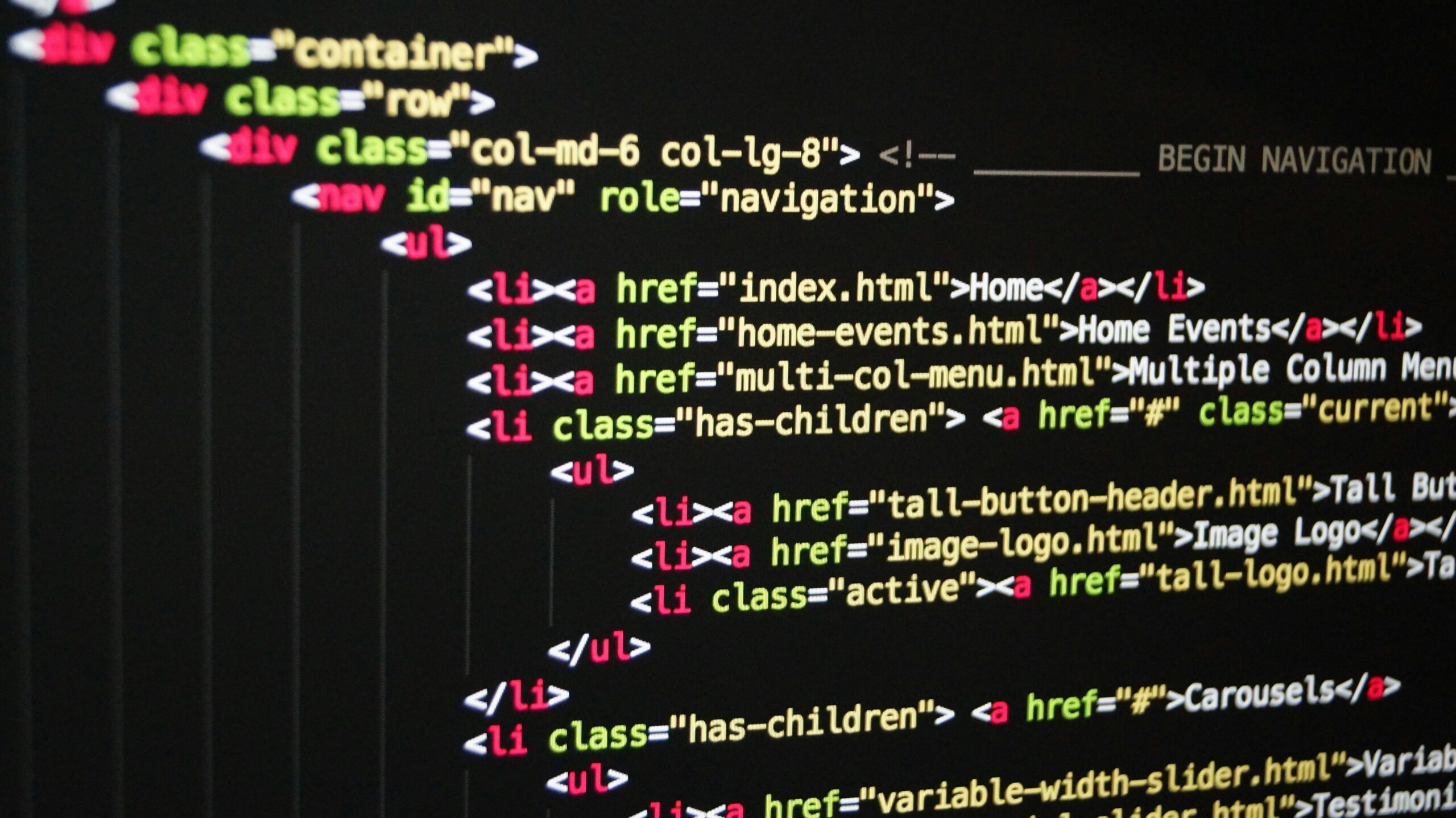
<main>
  <section class="em">
    <article class="em">
      <p>Lorem ipsum
      dolor sit amet</p>
    </article>
  </section>

  <section class="rem">
    <article class="rem">
      <p>Lorem ipsum
      dolor sit amet</p>
    </article>
  </section>
</main>
main {
font-size: 10px;
}
section.em {
font-size: 2em;
}
article.em {
font-size: 2em;
}As a result of this code, the <article> will result in a font size of 40px. This is because ems look to their parent element for the size. If section is set to 2em, then it looks to it’s parent, <main><article><section><section>
:root {
    font-size: 10px;
}

section.rem {
    font-size: 2rem;
}

article.rem {
    font-size: 2rem;
}
However, replacing the above CSS with this code, would result in the text being 20px. When the font size of <section><article>:root<html>
Block vs Inline Elements
Block elements span the entire width of the viewport which makes elements that come after it appear under it because there is no space next to them. Examples of these elements are headers, paragraphs, and lists
Inline elements do not take the entire width of the viewport. They only take up the space they need to based on their content. These can appear inside block elements. Some examples are span, a, and em.
Semantic Tags
Semantic elements are elements that give the browser some meaning as to what content will be going inside it. They don’t use up space on the screen and are for the developer to organize their code and content in a much easier manner both for them and anyone they want to share their code with. Semantic elements also make it easier to target a large block of code to style and then find it later because there aren’t a million divs. Before semantic elements, divs and spans were overwhelmingly used and classes and ids were used to differentiate them, but that quickly became extremely confusing. These are the most common semantic tags:
<header>
<nav>
<main>
<section>
<article>
<aside>
<footer>
Here are some more semantic tags.
Viewport Units
There are four viewport units: vh, vw, vmin, vmax. They are units of measurement used in CSS based on the viewport size. These units are responsive since they change with the size of the viewport. This is a helpful website to understand these units.
Vh stands for viewport height. 1vh is 1% of the viewport while 100vh is 100% of the viewport.
Vw stands for viewport width. 1vw is 1% of the viewport while 100vw is 100% of the viewport.
Vmin stands for viewport minimum. This is based off of the smallest dimension of the viewport. 1vmin would be 1% of the width if it was smaller than the length.
Vmax stands for viewport maximum. This is based off of the largest dimension of the viewport. 100vmax would be 100% of the length if it was larger than the width.
Emmet
Emmet is a toolkit that makes it easier to write HTML and CSS. This is the link to the emmet cheat sheet.
The following are shortcuts that I believe are the most helpful as well as the ones I use/have used the most:
Typing In Multiple Spots
Holding down Command while clicking multiple places in the code allows for the user to type the same thing in multiple spots. This is useful for adding things like classes or ids to multiple elements or indenting multiple elements. Press command again in the same spots to remove the effect.
Creating Long Blocks of Code With One Line
This line, nav#global>ul>li*5>a[href=#], creates the code below:
<nav id="global">
  <ul>
    <li><a href="#"></a></li>
    <li><a href="#"></a></li>
    <li><a href="#"></a></li>
    <li><a href="#"></a></li>
    <li><a href="#"></a></li>
  </ul>
</nav>
Now, let’s break it apart. The #nav#global>^*li*5
By default, when Emmet creates an anchor, the href attribute is already there, but there is nothing inside the quotation marks. To place a # inside the quotation marks (which in this context is used as a placeholder), use [][href=#]
Other Useful Short Cuts
Siblings
Text & Item Numbering
Grouping
header>h2^img+p
ul>li*5{Item $}
section>(header>h2+p)+p
<header>
  <h2></h2>
</header>
<img src="" alt="">
<p></p>
<ul>
<li>Item 1</li>
<li>Item 2</li>
<li>Item 3</li>
<li>Item 4</li>
<li>Item 5</li>
</ul><section>
<header>
<h2></h2>
<p></p>
</header>
<p></p>
</section>Developer Tools
To open the Developer Tools in Chrome: 3 dots in the corner > More Tools > Developer Tools or use the shortcut command + control + I.
In the developer tools, developers can click line by line on their html and see what styles are placed on it. Styles can be altered in real time temporarily in the Styles section on the right pane. However, if the page is refreshed, the styles are reset to how they are on the style sheet.
Furthermore, next to the Styles tab on the right pane is a pane called ‘Computed.’ Here, a developer can view how much space an element is taking up such as its border, margin, padding, and content.
Next to that is ‘Layout,’ which is used when flexbox or grid is placed on elements. A developer can select elements that have ordisplay: grid on them, and they’ll be highlighted in a color. Track sizes can be seen as well as numbers for use with grid. display: flex
A button to the left of ‘Elements’ is called “Toggle Device Toolbar.” When that is pressed, the width and height of the viewport and can be altered by dragging it. This is especially useful for media queries.
The developer tools can also be docked against different sides of the screen by clicking the 3 dots on the bottom right next to the ‘x.’ Docking them against the left or right sides allows for a developer to see the downward flow of their webpage as they build or style it in the beginning stages(like when they’re building the mobile version). It’s also easier to see all of the code at once without having to scroll. However, because of this, the amount of pixels in width is limited if the developer tools are docks on the sides, so when building tablet or computer version of the site, it may be easier to see how they’ll look if the developer tools are docked to the bottom.
Flexbox
Flex box is a one-dimensional responsive layout. There are flex containers and flex items. The flex container is the element that display: flex is placed upon. Flex is inherited so everything inside the flex container become flex items.
Flex Container
These are the properties that can be placed on the flex container:
justify-content
align-items
flex-direction
flex-wrap
flex-flow
gap
Flex Items
These are the properties that can be placed on the items:
order
flex-grow
align-selfalign-items
flex-shrink
flex-basis
flexflex-growflex-shrinkflex-basis
Media Queries
Media queries add responsiveness to a website. They set conditions on the webpage to change things like layout, or font size when they are met.
Note: Media queries weren’t working until I added this meta tag in the head element:
<meta name="viewport" content="width=device-width, initial-scale=1.0">@media screen and (min-width:850px) {
section {
display: flex;
justify-content: center;
gap: 3rem;
}
}For example, here is a media query, that states that when the viewport is 850px in width, everything inside will take effect.
This is at 411px in width. The text appears under the image because by default, they are block elements.

Below is at 1109px. It is over 850px so the conditions have taken effect. The display of the sections have been switched to flex so now they appear side by side.
